A pictorial logo communicates through an image; a lettermark logo communicates through initials. Choosing between them starts with your name, audience and smallest intended use. This guide uses invented examples so you can study structure without borrowing an established identity.
Lettermark, Pictorial Mark or Wordmark?
| Direction | Main material | Good starting point | Main test |
|---|---|---|---|
| Lettermark | Initials | A long organization name | Can someone read both letters? |
| Pictorial mark | Recognizable image | A concrete subject or story | Does the silhouette remain distinctive? |
| Wordmark | Full written name | A short memorable name | Is it readable with ordinary spacing? |
| Combination | Image and name | A new identity needing introduction | Do the parts work separately? |
Lettermarks save space, but initials alone tell a new audience very little. Pictorial logos can suggest a category, yet a generic leaf or camera can blend into the crowd. A combination gives each direction context: use the full name alongside the mark during introduction, then test the smaller symbol on secondary surfaces.
Four Original Lettermark Logo Examples
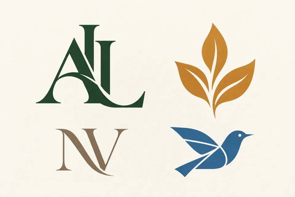
AL: Alder Lane. Two serif initials share a strong vertical rhythm. The overlapping construction creates a quiet editorial feel. Start with the separate letters and overlap gradually; the L must remain visible rather than disappearing into the A.
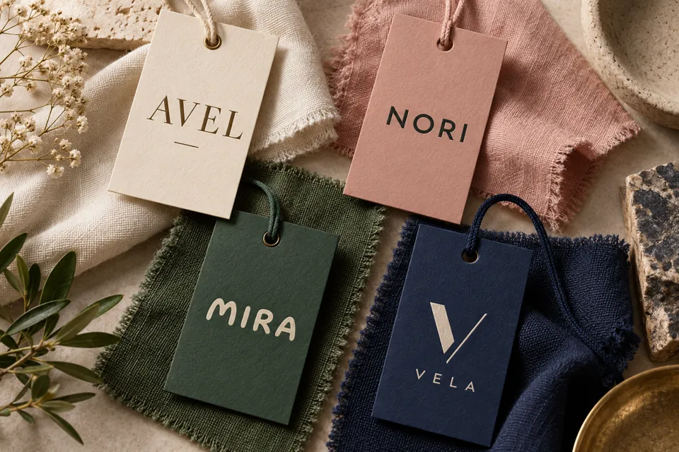
NV: North Vale. Wide strokes and open counters make this letter mark logo suitable for a compact fabric label. Test the N and V at the actual print size. Decorative hairlines that work on screen may disappear when reproduced on textured paper.
Amber leaf. This pictorial mark uses three clear leaves rather than a detailed botanical drawing. The shape suggests growth, but its proportions, negative spaces and orientation must carry the personality. Color should support the silhouette rather than rescue it.
Blue bird. An angular wing gives the bird a sense of movement. It is a 2D logo with flat shapes, useful for testing whether an idea survives without lighting, gradients or a product mockup. Ask a viewer what they see before telling them the intended subject.
Seven Fictional Brands, Three Logo Approaches Each
These original lettermark logo examples compare initials, pictorial marks and full names at a consistent size. Read each row from left to right, then decide which version best communicates the identity at your intended display size.
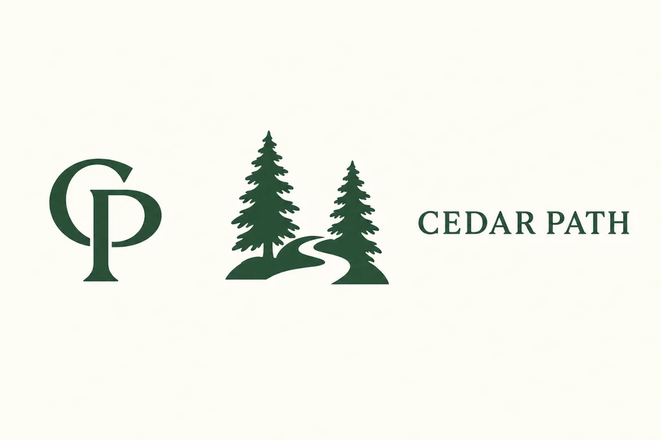
Cedar Path: Let a Pictorial Mark Explain the Activity
The CP initials stay compact, while the cedar-and-trail picture explains the walking theme. The full CEDAR PATH wordmark introduces the name. Use the picture with the name on a first announcement, then compare the initials and symbol on a small membership badge.
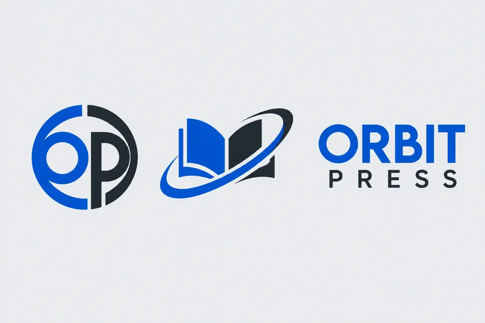
Orbit Press: Match Circular Letterforms to the Symbol
Round O and P shapes echo the orbit around an open book. This is a useful way to connect a lettermark logo and pictorial logo without drawing the same shape twice. The spaced second line gives the short word PRESS a comfortable width beneath ORBIT.
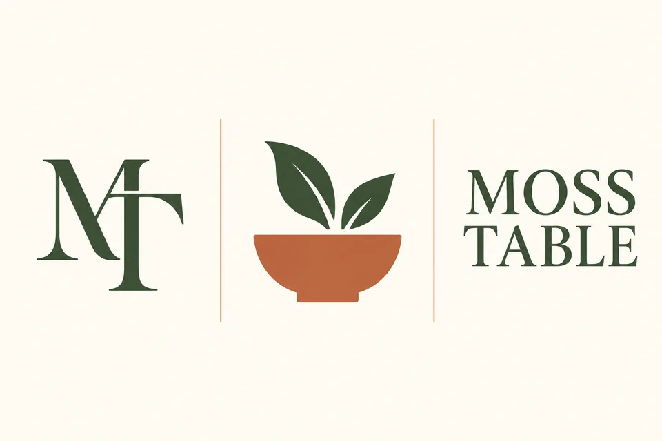
Moss Table: Keep Serif Initials Open
M and T can overlap without losing the tops and stems that identify them. The bowl-and-leaf pictorial mark communicates a shared table more directly than the initials. Keep enough space inside the bowl and around the leaves so the silhouette survives a small stamp.
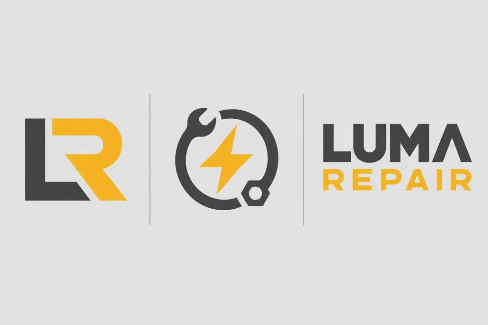
Luma Repair: Choose a Useful Visual Metaphor
The LR lettermark is built from substantial strokes. A spark inside a tool ring tells a different part of the story: practical repair and renewed function. Compare the three forms in one color before deciding whether the yellow accent improves visibility.
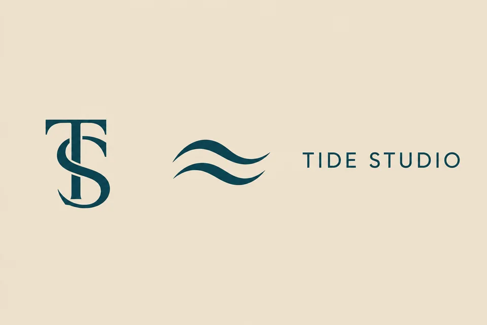
Tide Studio: Give a Quiet Mark Room to Breathe
The TS lettermark keeps both letters identifiable, while two wave shapes create a calmer pictorial mark. Wide clear space suits the restrained wordmark. On a small ceramic label, choose either the initials or waves; squeezing all three forms together adds little information.
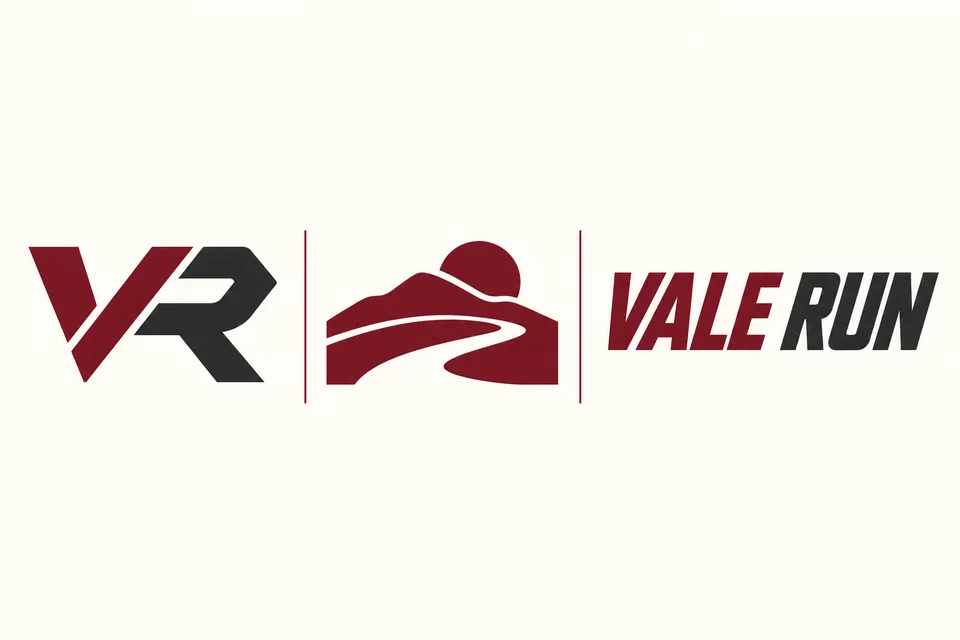
Vale Run: Test a Directional Lettermark
The diagonal VR initials suggest forward movement. The separate path-and-hill symbol gives the running club a place-based story. The slanted wordmark carries the same energy, but its counters must remain open at the size used on a shirt label.
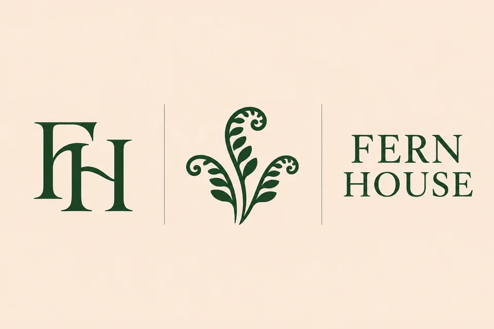
Fern House: Simplify Organic Shapes
A fern can become a clear pictorial logo when it uses a few large leaf shapes instead of many fine fronds. The FH serif lettermark gives the same identity a compact option. Keep the full name nearby on packaging until the symbol becomes familiar to the audience.
How to Build a Meaningful Letter Logo
- Write the full invented brand name and identify the initials people will actually use.
- Choose one visual idea: shared stem, diagonal rhythm, enclosed counter or small negative-space detail.
- Sketch the letters separately before combining them. Avoid adding a hidden object that makes the letters ambiguous.
- Test in one color at avatar, label and page-header sizes. Compare dark-on-light and light-on-dark versions.
- Place the mark next to the full name and check spacing. Keep a simple horizontal lockup and a compact stacked version.
Lettermark logo design benefits from constraints. Two letters and one distinctive cut are usually easier to evaluate than four initials, three colors and several symbols. Make a small sheet of alternatives with consistent size so the presentation does not bias your decision.
Prompt Recipes for Original designs
Try this in the AI image generator:
Create an original lettermark for the fictional studio Alder Lane using only the letters AL. Strong readable serif initials, one shared vertical stroke, deep forest green on plain ivory, generous clear space, flat shapes, no mockup, no existing brand references.
For pictorial mark logos:
Design an original geometric bird symbol for the fictional walking club North Vale. Three angular wing shapes, one clear eye, blue on ivory, a distinctive readable silhouette, flat 2D presentation, no letters, no existing logos.
Generate a few directions, then change one variable at a time. A beautiful mockup does not prove a mark works. Evaluate the plain artwork before adding embossing, fabric or dramatic lighting. For a team identity, use the sports logo generator; for a music project, explore the band logo generator.
Choosing and Refining the Final Direction
Compare designs using a practical scorecard: readability, distinctive silhouette, spacing, suitability to the name and performance at small sizes. Letter brands built around initials need a clear introduction; picture-based identities need a symbol that is more specific than the category itself. Neither approach guarantees recognition without consistent use.
Check the artwork on a plain square, a narrow label and a monochrome document. Save the original high-resolution design, then redraw clean paths if your production workflow needs vector artwork. Review resemblance to existing marks before adopting a name or symbol.
Read the fashion logos guide for label and garment applications. Pictorial marks and lettermarks can also be developed together as a coordinated family, with the same stroke weight and spacing logic.
Frequently Asked Questions
What is a pictorial logo?
A pictorial logo uses a recognizable image, such as a bird, leaf or cup, as its main identifier. The picture can suggest a product, purpose or personality without spelling the brand name.
What is a lettermark logo?
A lettermark logo represents a name through its initials. Two or three carefully drawn letters replace a longer name, making a compact mark for labels, avatars and packaging.
How do lettermarks differ from monogram logos?
Lettermarks identify a brand with initials; monograms often overlap or interlock those letters. A lettermark can be a monogram, but spaced initials can also function as lettermarks.
What makes a meaningful letter logo?
Connect one distinctive detail to the business: a cut resembling a path for a walking club, for example. Keep the letters readable before adding hidden symbolism.
Are pictorial marks better than letter mark logos?
Neither is universally better. Pictorial marks can communicate a familiar subject, while letter mark logos work well for long names. Test both at the size and on the materials where they will appear.
Can I combine a pictorial mark with a name?
Yes. A combination mark pairs a symbol with a full name. Establish the name and symbol together before relying on the symbol alone.
What is the difference between a wordmark and a lettermark?
A wordmark spells the full name; a lettermark uses initials. Clever wordmarks can alter a letter or spacing while retaining the whole readable name.
Can AI help with lettermark logo design?
Use AI to explore compositions and color directions, then check spelling, readability and resemblance to existing marks. Generated raster designs may need manual vector redrawing for production.