
Best Fonts for YouTube Thumbnails: 14 Picks, Colors and Text Size
Find the best YouTube thumbnail font: 14 bold Google Fonts sorted by niche, a live font tester for your own title, and outline, color and text size tips.

Short answer: the best fonts for YouTube thumbnails are heavy, simple and easy to read at phone size. Anton is the safest pick for loud titles, Bebas Neue fits long words and numbers, Montserrat Black suits vlogs and lifestyle, Roboto Black and Poppins Black suit tutorials, and Bangers or Luckiest Guy bring cartoon energy. Use two to five words, a thick dark outline and bright text, and check the result at phone size.
Below you can try every YouTube thumbnail font on this list with your own title, see which thumbnail fonts suit each niche, and learn the color, outline and size rules that make text readable in a crowded feed. All 14 fonts are free on Google Fonts.
Test YouTube Thumbnail Fonts on Your Own Title
Type the words you plan to put on your next thumbnail. Each card renders them in a different font at 16:9, the shape of a YouTube thumbnail. Switch the color scheme, turn the outline and drop shadow on or off, and compare. Think of it as a quick YouTube thumbnail font generator: when one card jumps out at you, that is your font.
- YOU WON'T BELIEVE THIS
- YOU WON'T BELIEVE THIS
- YOU WON'T BELIEVE THIS
- YOU WON'T BELIEVE THIS
- YOU WON'T BELIEVE THIS
- YOU WON'T BELIEVE THIS
- YOU WON'T BELIEVE THIS
- YOU WON'T BELIEVE THIS
- YOU WON'T BELIEVE THIS
- YOU WON'T BELIEVE THIS
- YOU WON'T BELIEVE THIS
- YOU WON'T BELIEVE THIS
- YOU WON'T BELIEVE THIS
- YOU WON'T BELIEVE THIS
The fonts load from Google Fonts. Each card links to the font's page, where you can download it for free.
What Makes Good Thumbnail Fonts?
A thumbnail is seen at a few centimeters wide on a phone, next to a dozen other thumbnails, for about as long as it takes to scroll past it. Good thumbnail fonts survive that test, and the best fonts for thumbnails all share four things:
- Heavy weight. Thick strokes stay visible when the image shrinks. Use Bold, Black or a display font that is heavy by design; regular and light weights disappear.
- Simple shapes. Plain sans-serif letters read faster than script, distressed or very decorative fonts. Save fancy fonts for one accent word.
- Clear numbers. "10", "$500" and "24 HOURS" are common hooks. Check that the 1, 4 and 7 in your font are easy to tell apart.
- The right width. Condensed fonts (Anton, Bebas Neue, Oswald) fit more letters in the same space; wide fonts (Archivo Black, Montserrat Black) look bold with one or two short words.
Cool thumbnail fonts can have personality, as long as they keep those four traits. A comic font like Bangers is still heavy and simple; a thin brush script is not.
The Best Fonts for YouTube Thumbnails, by Style
Here are the popular YouTube thumbnail fonts grouped by the look they give a video, each shown on a real thumbnail layout. Every one is on Google Fonts.
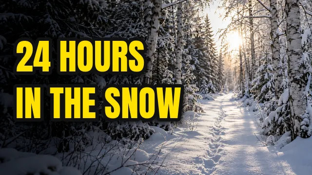
Anton: Heavy and Condensed
The classic YouTuber font look: tall, thick and punchy. Best for challenges, travel, sports and anything with a number in the hook.
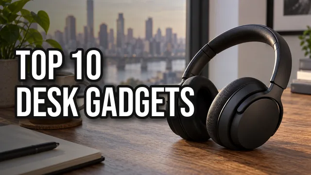
Bebas Neue: Tall All Caps
Fits longer words in less space, so it is ideal for lists, rankings and tech reviews. Use a thicker outline, because its strokes are thinner than Anton.
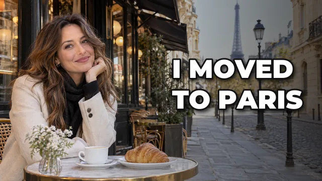
Montserrat Black: Clean and Wide
A friendly, modern look for vlogs, travel, lifestyle and reviews. At the Black weight it stays readable small.
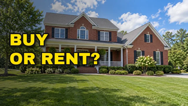
Archivo Black: Wide and Serious
Blocky and confident. Good for finance, business, news and commentary, where you want weight without looking playful.

Lilita One: Rounded and Friendly
Soft, chunky letters for pets, family, kids and cozy gaming channels. Pair it with bright outline colors.
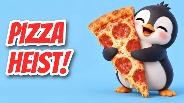
Bangers: Comic-Book Energy
Slanted, loud and fun. Use it for fails, pranks, reactions and animation, and keep the text to two words.
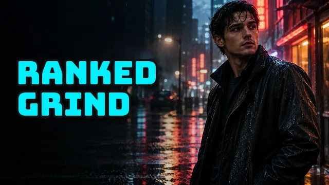
Bungee: Gaming and Esports
Square, sign-like letters that look great in neon colors. A good fit for gaming, esports and tech setups.
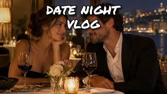
Permanent Marker: Handwritten Vlog
Feels personal and spontaneous. Use it for vlogs, notes and arrows, or as an accent next to a heavier font.
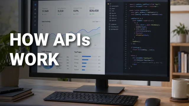
Roboto Black: Clear Explainers
Neutral and very legible, and it matches the YouTube interface. Best for tutorials, coding, science and education.
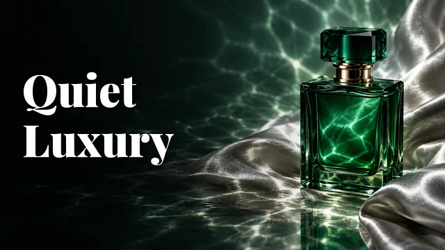
Playfair Display: Elegant Serif
A high-contrast serif that still reads at small sizes when you use the Black weight. Beauty, fashion, luxury and storytelling.
Best YouTube Thumbnail Fonts Compared
Use this table to shortlist two or three candidates, then test them in the font tester above with your real title.
| Font | Style | Best for | Weight to use | Watch out for |
|---|---|---|---|---|
| Anton | Heavy condensed sans | Challenges, travel, sports, reactions | Regular (only weight, already heavy) | Very common, so add your own color system |
| Bebas Neue | Tall all-caps sans | Lists, rankings, tech, gaming | Regular (only weight) | Thinner strokes: use a thick outline |
| Oswald | Condensed sans | Reviews, news, explainers | Bold (700) | Looks plain without color or a box |
| Montserrat | Wide geometric sans | Vlogs, lifestyle, travel, reviews | Black (900) or ExtraBold (800) | Wide letters: keep it to a few words |
| Poppins | Rounded geometric sans | Tutorials, study, productivity | Black (900) | Lighter weights get lost small |
| Archivo Black | Wide blocky sans | Finance, business, commentary | Regular (only weight) | Takes a lot of horizontal space |
| Roboto | Neutral sans | Education, coding, science | Black (900) | Can feel generic without a strong color |
| Rubik | Softly rounded sans | Family, food, DIY | Black (900) | Less punch than Anton for drama |
| Lilita One | Chunky rounded display | Pets, kids, family, cozy gaming | Regular (only weight) | Too cute for serious topics |
| Luckiest Guy | Cartoon display | Kids, challenges, party games | Regular (only weight) | Hard to read in long phrases |
| Bangers | Comic-book display | Fails, pranks, reactions, animation | Regular (only weight) | Slanted letters: two words max |
| Bungee | Square sign display | Gaming, esports, tech setups | Regular (only weight) | Wide: short words only |
| Permanent Marker | Handwritten marker | Vlogs, notes, arrows, accents | Regular (only weight) | Not for long hooks or small text |
| Playfair Display | High-contrast serif | Beauty, fashion, luxury, stories | Black (900) | Thin serifs vanish at light weights |
The Best Font for Thumbnails in Your Niche
If you are still unsure, start from your niche. These pairings are starting points, not rules; what matters is that one heavy font becomes recognizably yours.
| Niche | Best thumbnail font | Backup pick | Color idea |
|---|---|---|---|
| Gaming | Bungee or Luckiest Guy | Anton | Cyan or yellow, black outline |
| Tech reviews | Bebas Neue | Oswald Bold | White, black outline, one accent color |
| Vlogs and travel | Montserrat Black | Permanent Marker for one accent word | White with a soft shadow |
| Education and how-to | Roboto Black or Poppins Black | Archivo Black | White on a dark box |
| Finance and business | Archivo Black | Anton | Yellow or green, black outline |
| Comedy, challenges and reactions | Anton or Bangers | Luckiest Guy | Yellow or red, thick outline |
| Beauty and fashion | Playfair Display Black | Montserrat Black | White or blush pink |
| Kids, pets and family | Lilita One | Rubik Black | White with a bright outline |
| Food and cooking | Rubik Black | Montserrat Black | White or warm yellow |
| Fitness and sports | Anton | Bebas Neue | White and red |
What Font Do YouTube Thumbnails Use?
People often ask what the YouTube thumbnail font is, as if YouTube set one. It does not. A thumbnail is just an image you upload, so the creator chooses the font in an editor before uploading. That is why there is no single answer, only a set of popular YouTube thumbnail fonts that keep coming back:
- Impact is the original meme-era thumbnail font. It comes pre-installed on Windows and macOS, so a generation of creators used it by default. Anton is the free Google Fonts look-alike.
- Bebas Neue, Montserrat and Oswald took over as channels moved toward cleaner, more designed thumbnails.
- Roboto is the font of the YouTube interface itself; on the website, the video title under your thumbnail is set in it. Using Roboto Black on the thumbnail gives a tidy, native look.
Popular YouTuber Fonts That Are Not on Google Fonts
A few YouTuber fonts you will see often are commercial or come with an operating system rather than Google Fonts: Impact, Futura Bold, Helvetica Black, Burbank Big Condensed (a common gaming look) and Komika Axis (a comic style). They can look great, but check each font's license before you use it on a monetized channel. If you want a free alternative, Anton stands in for Impact, Montserrat Black is close in spirit to Futura Bold, Roboto Black or Archivo Black for Helvetica Black, Bebas Neue or Oswald for condensed gaming fonts, and Bangers for comic styles.
Make Thumbnail Text Pop: Outline, Shadow and Color
The font is only half the job. On a busy photo, even the best thumbnail font needs an outline or a shadow to separate it from the background.
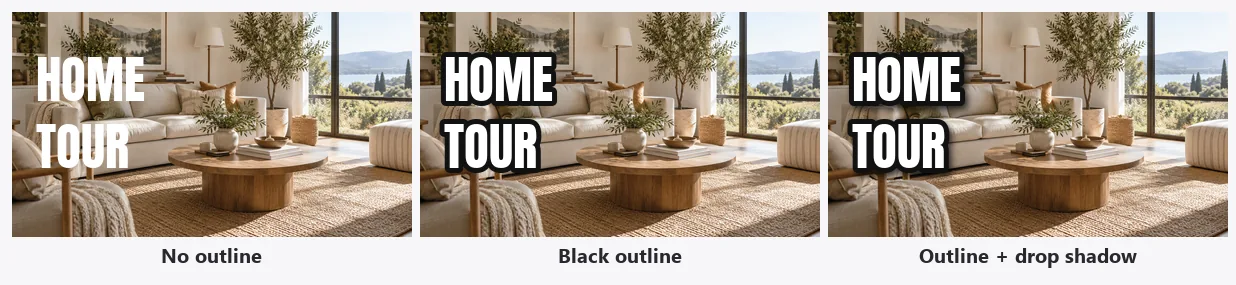
- Outline: a dark stroke around light letters is the most reliable fix. Make it about 6 to 10 percent of the letter height, thick enough to see at phone size.
- Drop shadow: a soft, dark shadow below and to the right lifts the text off the photo. Use it with an outline or on its own on calmer backgrounds.
- Box or banner: for very busy images, put the words on a solid yellow, white, red or black shape. It always reads, and it can become your channel's signature.
- Darken one side: a subtle dark gradient behind the text keeps the subject bright and the words readable.
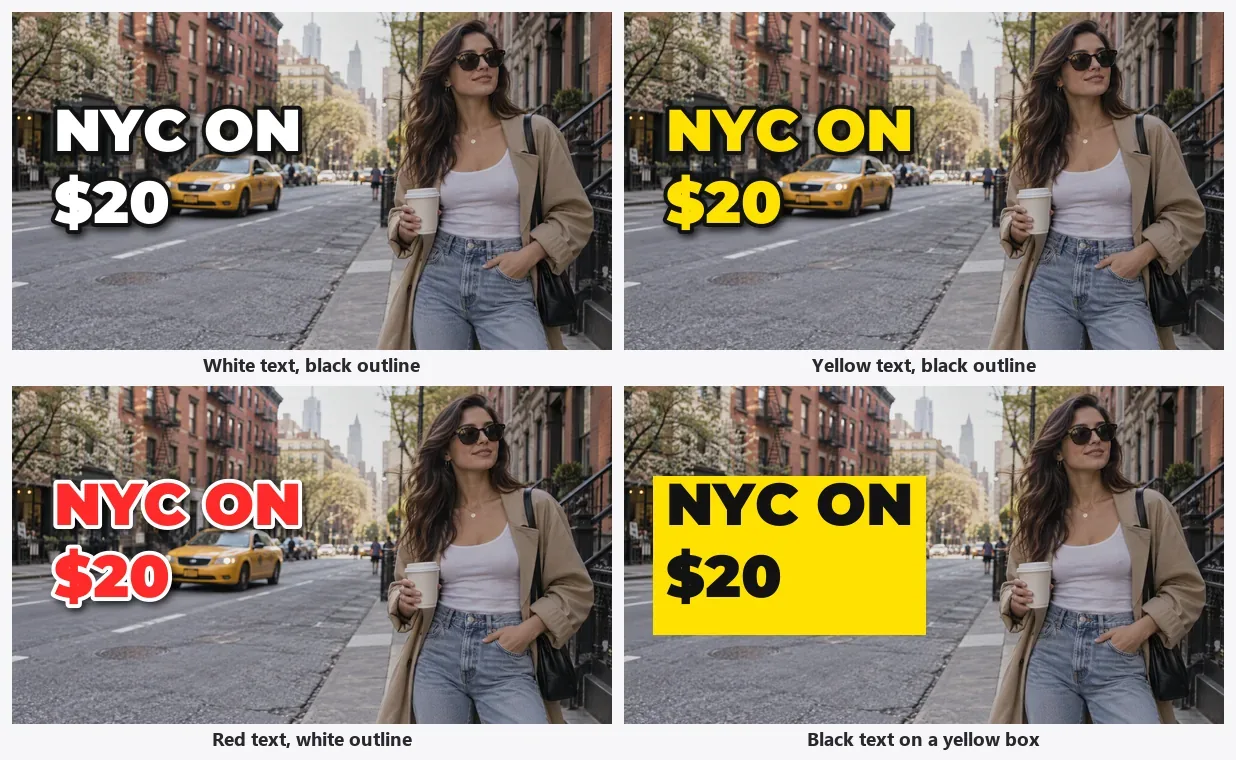
Color rules of thumb:
- White and bright yellow are the most readable fill colors on photos. Yellow pops against blue skies, greens and dark scenes.
- Red draws attention but is harder to read; give it a white outline and keep it for one word.
- Match one accent color to your channel and use it on every thumbnail, the same way you reuse your font.
- Check both light and dark mode. Thumbnails sit on white and on near-black backgrounds, so avoid text that relies on the page color around it.
Thumbnail Text Size and Readability
Most views happen on phones, where a thumbnail in the feed is only a few centimeters wide. Text that looks huge in your editor can turn into a smudge there.
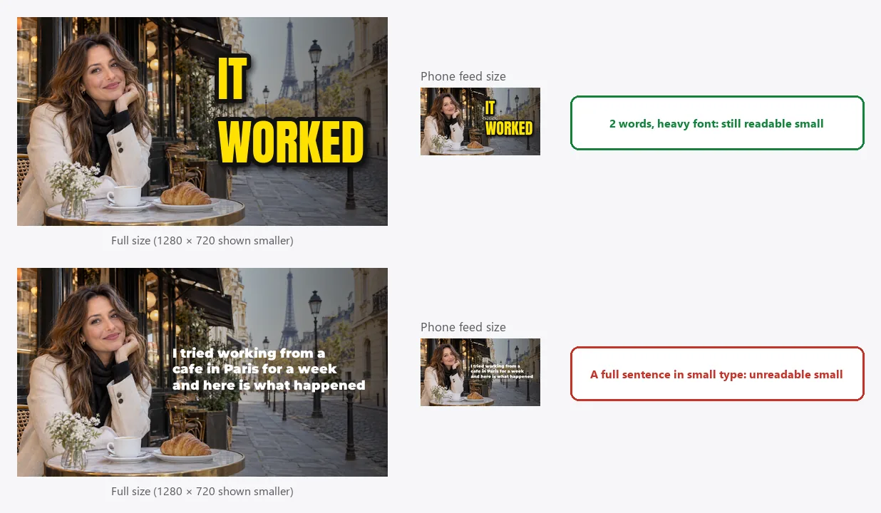
- Two to five words. The thumbnail adds a hook; the title under it gives the context. Do not repeat the title word for word.
- Big letters. Make each line at least about a sixth of the image height, roughly 120 pixels or more on a 1280 × 720 thumbnail. Your main word can be much bigger.
- One or two lines. Stack the words rather than running a long single line.
- Test small. Zoom your canvas out until the thumbnail is about the size it appears in a phone feed. If you cannot read it in a second, cut words or go bigger and heavier.
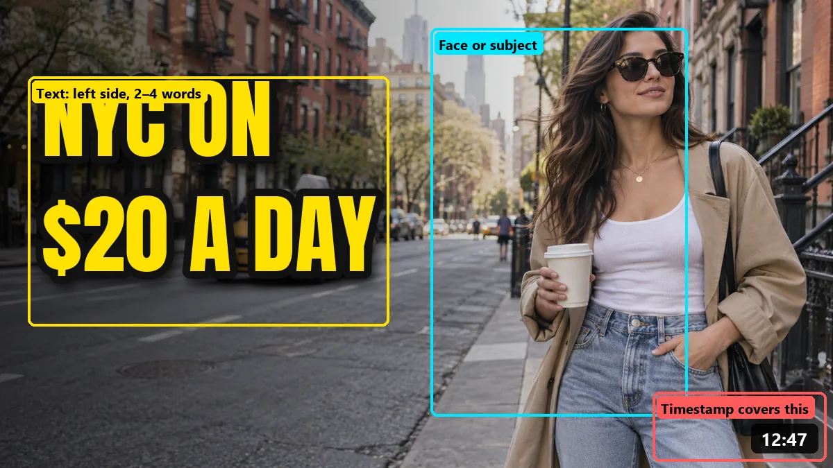
Layout matters too. Put the text on the side away from the face, leave the subject room to breathe, and keep anything important out of the bottom-right corner, where YouTube overlays the video length. Make the canvas 1280 × 720 pixels (16:9); if your photo is a different shape, the YouTube thumbnail size tool crops or fits it to the exact size in your browser before you add the words.
How to Pair Thumbnail Fonts
One font is often enough. When you want a second line or a small label, pair a heavy headline font with a calm support font and keep the support text much smaller:
- Anton + Roboto: loud headline, neutral label ("I SURVIVED 24 HOURS" + "in a snow cabin").
- Bebas Neue + Montserrat: tall list title with a wide, friendly subtitle.
- Montserrat Black + Permanent Marker: clean hook plus one handwritten word or arrow.
- Playfair Display Black + Montserrat: an elegant serif headline with a simple sans label.
Avoid mixing two display fonts, such as Bangers with Bungee. They fight for attention and the thumbnail looks noisy.
Best YouTube Fonts for Your Channel Name, Logo and Banner
The best fonts for YouTube channel art follow the same logic as thumbnails, but they also need to look good at very small sizes, such as your profile picture next to comments. A common question is which font for YouTube logo ideas works best. Do not copy YouTube's own lettering: the YouTube wordmark uses YouTube Sans, a custom brand typeface that is not on Google Fonts and is not licensed for channel designs. Choose a font that is yours instead. Try your channel name here:
- MAYA MAKES
- MAYA MAKES
- MAYA MAKES
- MAYA MAKES
- MAYA MAKES
- MAYA MAKES
- Use the same font on your banner, your profile picture and your thumbnails, so people recognize the channel everywhere.
- For a banner, keep your name and tagline inside the central safe area that shows on every device. The YouTube banner size tool shows that area while you crop.
- For a profile picture or logo badge, one or two letters in a heavy font read better than a full name. The YouTube PFP maker can turn a photo or idea into a channel avatar in a matching style.
How to Add a Font to Your YouTube Thumbnail
- Pick the font. Test your title in the font tester above and download the winner from Google Fonts. Install it on your computer, or upload it to your online editor if it supports custom fonts.
- Prepare the background. Use a sharp frame from your video or a photo, sized to 1280 × 720. Need a background you do not have? The AI image generator can create a scene from a short description, and the background remover cuts you out of a photo so you can place yourself in front of it.
- Add the text. Type two to five words, set the font at a heavy weight, and make it big.
- Style it. Add a dark outline (6 to 10 percent of the letter height), a soft drop shadow, or a solid box behind the words.
- Check it small and export. Zoom out to phone size, fix anything you cannot read, and export a JPG or PNG.
Want the words themselves to carry an image, like a travel photo inside big letters? The picture inside text tool fills any text with your photo, which makes an eye-catching title card or end screen.
YouTube Thumbnail Font FAQ
What is the best font for YouTube thumbnails?
There is no single best font for YouTube thumbnails, but the ones that work share three traits: a heavy weight, simple letter shapes and clear numbers. Anton is the safest all-rounder for loud, punchy titles, Bebas Neue fits long words and lists, Montserrat Black suits vlogs and lifestyle, and Bangers or Luckiest Guy add cartoon energy. Pick one heavy font for the hook and use it on every video.
What is the YouTube thumbnail font?
YouTube does not add text to thumbnails or set a font for them; creators add the words in an editor before uploading. The most popular YouTube thumbnail fonts are heavy sans-serifs such as Impact, Anton, Bebas Neue, Montserrat and Oswald. The YouTube interface itself, including the video titles under each thumbnail on the website, uses Roboto.
What font is the YouTube logo?
The YouTube wordmark and brand graphics use YouTube Sans, a custom typeface made for the brand. It is not on Google Fonts and is not licensed for your own designs, and YouTube’s brand guidelines ask creators not to modify or imitate its logo. The original 2005 logo was based on a modified Alternate Gothic. For your own channel name, try a heavy geometric font such as Montserrat Black or Poppins.
Are Google Fonts free to use on YouTube thumbnails?
Yes. Google Fonts families are released under open licenses, mostly the SIL Open Font License and some under Apache 2.0, which allow commercial use, including thumbnails on monetized channels. Fonts from other sites vary: a font labeled “free for personal use” does not cover a monetized channel, so read the license before you use it.
How big should text be on a YouTube thumbnail?
Make each line of text at least about a sixth of the thumbnail height, roughly 120 pixels or more on a 1280 × 720 thumbnail, and keep the hook to two to five words. Then shrink the design to phone-feed size: if you cannot read it in a second, make the words fewer or bigger, or switch to a heavier font.
Is there a YouTube thumbnail font generator?
The font tester on this page works like a YouTube thumbnail font generator: type your title and see it in 14 thumbnail fonts at once, with colors, outline, drop shadow and all caps. It runs in your browser for free. When you have picked a font, install it from Google Fonts and add the text in your thumbnail editor.
What colors work best for thumbnail text?
High contrast wins: white or bright yellow text with a thick black outline reads on almost any photo, red with a white outline is good for warnings and reactions, and black text on a yellow or white box works on busy backgrounds. Avoid dark text on dark photos and thin colored text without an outline.
Should I use the same font on every thumbnail?
Usually yes. Using one or two thumbnail fonts in the same colors makes your videos recognizable in search and in the subscription feed. Change the photo and the words for every video, and keep the font, outline and color system as your channel style.
Impact, Futura, Helvetica, Burbank, Komika Axis, YouTube and YouTube Sans are trademarks of their respective owners and are mentioned only to identify them. EzImgMaker is not affiliated with YouTube or Google. The thumbnails on this page are demo layouts made with the fonts named in each caption.